Quantcast
Channel: Thoughts on software development
Viewing all 79 articles
Browse latest View live

Hot Deployment with IntelliJ IDEA

$
0
0
Recently there was a voting in the PrimeFaces forum PrimeFaces IDE Poll for the best IDE used to develop PrimeFaces applications. The most people voted for NetBeans. NetBeans and Eclipse are free IDEs. My favorite IDE IntelliJ IDEA Ultimate is not free and I think this is a reason why there are less people using it on the job. I thought it would be a good idea to show some nice features in IntelliJ. This post will demonstrate how to configure IntelliJ for the hot deployment when developing web projects. Hot deployment means you can change web resources or classes at runtime and the changes will be recognized immediately without server restart. An useful feature during development process. In the example, I will take the application server JBoss 7, but any other server can be configured in the same manner as well. A good introduction to IntelliJ and JBoss there is in the IntelliJ Wiki. For a general information regarding working with application servers in IntelliJ please refer this help page.

We assume, the application server is already configured. The next step is to configure an exploded WAR artifact for the web project. An exploded WAR is a decompressed web application archive, a directory structure that is ready for deployment on an application server. IntelliJ creates it automatically, but nevertheless, you should go to File --> Project Structure --> Artefacts and ensure that the exploded web application ends with the extension .war. If you use Maven, the exploded WAR is created below the target folder. More info on the help page.


You should also check if the Hot Swap is enabled. Go to the File --> Settings --> Debugger --> HotSwap and ensure that all checkboxes are checked and the radio button "Reload classes after compilation" is set to "Always".


As next step, click on the "Edit Configurations..." and go to the configured server. In the "Run/Debug Configurations" dialog, select "Update resources" in the drop-down "On frame deactivation". That means, when you switch to the browser, IntelliJ will copy resource files (JavaScript, CSS) from the source location (src/main/webapp) to the directory where it builds the exploded WAR to deploy.


Hot deployment for changed Java classes is resticted by JVM. E.g. the hot deployment for classes with changed method signature(s) doesn't work. But if you changed a method body, it will work. So, if you don't use JRebel which allows the hot deployment for classes being structurally modified, you can still rely on IntelliJ. All what you need to do for changes in Java classes is to recompile them. For that, you can go to the menu Build --> Compile or simple hit Ctrl + Shift + F9. After that, go to the browser and refresh the page to see changes.


What is your structure of JEE based web projects?

$
0
0
In this post I will try to discuss diverse organization structures of web based projects, mostly with JSF. The first thought when starting a new project is how to organize my Java packages? Imagine, you develop a web based user and group management system. A long time I used the following structure of Java packages which separates bean classes from model classes (model classes are sometimes called view helpers).


This is a good layout in my optinion, but it is not good enough if you have big projects. Why? Although some bean and model classes belong together, they are located far from each other. You have to navigate and scroll in your IDE between the bean and model packages. This can steal some time. Over the years I have realized that a grouping of classes according to their logical / semantic meaning may looks better. That means, model packages and classes are located in the same superordinated packages as beans they belong to. Common used beans and model classes can be placed in an extra package, say e.g. common.


But be careful here. Some developers prefer to blow up the count of beans. If you follow strict the MVC-pattern, you need backing beans, controller beans and view interfaces, beans. Backing beans take responsibility for component, value binding and delegation of events. They delegate the business logic's execution to the controller beans. Controller beans communicate with the underlying backend system(s). This fine-tuned separation of concepts increases the testability of small software pieces, but it leads to many classes and can complicate the project's structure under some circumstances.


What is about web pages? Here there are more or less the same two approaches. The first one follows the approach described e.g. in this article. There are three main folders: templates, views and sections. Templates are facelets templates used on (almost) every page. Views are full pages. They are bound to URLs in browsers. Views use templates. Sections are small pieces on a page. Sections are included by views (think on ui:include). The structure looks as follows:


You also see here a folder shared which contains some common used stuff. Pages for users and groups include a common section dialogs.xhtml. It is placed below /sections/shared/usergroups. As I aleady said, I realized that the grouping of pages and sections, when they belong together, could be a better approach. So, the next structure has two main folders pages and templates. Sections are located under includes in the same superordinated folders as pages which include them.


The grouping looks more efficient now in terms of IDE's navigation. It is also clear what parts belongs together. In the last picture you also see that the folder usergroups contains sub-folders users, groups and the common includes shared on different pages in the context of user / group management.

What is your preferred structure? Share your thoughts. Any feedback is welcome.

PrimeFaces Extensions 1.1.0 released. Introduction to flexible grid layout.

$
0
0
We are glad to announce the next release 1.1.0 of PrimeFaces Extensions. Beside fixed issues (full list on GitHub) we added a new JSF component FluidGrid. FluidGrid is a cascading grid layout component. It works by placing elements in optimal position based on available vertical space, sort of like a mason fitting stones in a wall. It is responsive, meaning the grid will reflow as the window size changes. Modern web sites are not imaginable without a responsive design. Good designed web sites look well on every device and with every screen resolution. The basic prerequisite for that is a dynamic fluid layout which fits any browser sizes. The new component FluidGrid allows to set up a nice tight grid with items that have variable heights and widths. Items inside of FluidGrid can have any content: text, images, links, input fields, etc. They can be defined in a static or in a dynamic way as in data iteration components.

Let me show some features to get a first impression what the component can. The first example demonstrates a simple usage with static items. Static items are defined by the tag pe:fluidGridItem which can be placed multiple times below the main tag pe:fluidGrid. Items can have different width / height specified by style classes. The main container for the pe:fluidGrid has the style class pe-fluidgrid and the container of the pe:fluidGridItem has the style class pe-fluidgrid-item.
<pe:fluidGrid hGutter="10" vGutter="10">
<pe:fluidGridItem styleClass="ui-widget-header">Item 1</pe:fluidGridItem>
<pe:fluidGridItem styleClass="ui-widget-header w2 h2">Item 2</pe:fluidGridItem>
<pe:fluidGridItem styleClass="ui-widget-header h3">Item 3</pe:fluidGridItem>
<pe:fluidGridItem styleClass="ui-widget-header h2">Item 4</pe:fluidGridItem>
<pe:fluidGridItem styleClass="ui-widget-header w3">Item 5</pe:fluidGridItem>
<pe:fluidGridItem styleClass="ui-widget-header">Item 6</pe:fluidGridItem>
<pe:fluidGridItem styleClass="ui-widget-header">Item 7</pe:fluidGridItem>
<pe:fluidGridItem styleClass="ui-widget-header h2">Item 8</pe:fluidGridItem>
<pe:fluidGridItem styleClass="ui-widget-header w2 h3">Item 9</pe:fluidGridItem>
<pe:fluidGridItem styleClass="ui-widget-header">Item 10</pe:fluidGridItem>
... etc. ...
</pe:fluidGrid>

<h:outputStylesheet id="fluidGridCSS">
.pe-fluidgrid {
max-width: 900px;
}

.pe-fluidgrid .pe-fluidgrid-item {
width: 60px;
height: 60px;
border-radius: 5px;
padding-top: 0.5em;
text-align: center;
}

.pe-fluidgrid-item.w2 {width: 130px;}
.pe-fluidgrid-item.w3 {width: 200px;}
.pe-fluidgrid-item.h2 {height: 100px;}
.pe-fluidgrid-item.h3 {height: 130px;}
</h:outputStylesheet>
In the example we used two attributes hGutter and vGutter for horizontal and vertical space between items. The result look like


After browser resizing all items are rearranged according to the available browser window size. No horizontal scrollbar appears.


Dynamic items can be put in a collection or list of FluidGridItem instances. A FluidGridItem instance contains a data object (of any data types) and an optional property type to match the type attribute in pe:fluidGridItem (see the last example with dynamic form). Dynamic items can be accessed in XHTML via the value attribute and exposed via the var attribute.
<pe:fluidGrid value="#{fluidGridDynamicController.images}" var="image" fitWidth="true" hasImages="true">
<pe:fluidGridItem>
<h:graphicImage library="images" name="fluidgrid/#{image.name}"/>
</pe:fluidGridItem>
</pe:fluidGrid>
The bean looks like
@ManagedBean
@ViewScoped
public class FluidGridDynamicController implements Serializable {

private List<FluidGridItem> images;

@PostConstruct
protected void initialize() {
images = new ArrayList<FluidGridItem>();

for (int j = 0; j < 3; j++) {
for (int i = 1; i <= 10; i++) {
images.add(new FluidGridItem(new Image(i + ".jpeg")));
}
}
}

public List<FluidGridItem> getImages() {
return images;
}
}
The result and more details can be seen in the showcase (second use case).

The next example demonstrates how to specifies elements which are stamped within the grid layout. These are special layout elements which will not be laid out by FluidGrid. Rather, FluidGrid will layout items below stamped elements. To specify stamped elements, use the stamp attribute which can be any search expression supported by the PrimeFaces Search Expression Framework. The XHTML code looks as follows
<pe:fluidGrid stamp="@(.pe-fluidgrid .stamp)" resizeBound="false" widgetVar="fluidGridWdgt">
<div class="stamp"></div>

<pe:fluidGridItem styleClass="ui-widget-header"/>
<pe:fluidGridItem styleClass="ui-widget-header w2 h2"/>
<pe:fluidGridItem styleClass="ui-widget-header h3"/>
<pe:fluidGridItem styleClass="ui-widget-header h2"/>
<pe:fluidGridItem styleClass="ui-widget-header w3"/>
<pe:fluidGridItem styleClass="ui-widget-header"/>
<pe:fluidGridItem styleClass="ui-widget-header h2"/>
<pe:fluidGridItem styleClass="ui-widget-header w2 h3"/>
<pe:fluidGridItem styleClass="ui-widget-header"/>
... etc. ...
</pe:fluidGrid>
More infos can be seen in the showcase (third use case). The next screenshots show a grid layout with a stamped element and without stamping after the button "Toggle stumped" was pressed.


Now the last, the most important example, the FluidGrid was implemented for. The example demonstrates how to design a responsive dynamic grid with input fields. This is similar to the DynaForm component in PrimeFaces Extensions, but the grid is not a fixed table in this case. It is responsive! The grid layout with input fields is placed within the center pane in pe:layout. The results before and after resizing the center layout pane are shown below. Try to resize the browser window of this example to see it in action.


The XHTML code looks like
<pe:fluidGrid id="fluidGrid" value="#{fluidGridDynaFormController.items}" var="data"
resizeBound="false" hGutter="20" widgetVar="fluidGridWdgt">
<pe:fluidGridItem type="input">
<div class="dynaFormLabel">
<p:outputLabel for="txt" value="#{data.label}"/>
</div>
<p:inputText id="txt" value="#{data.value}" required="#{data.required}"/>
</pe:fluidGridItem>
<pe:fluidGridItem type="select" styleClass="select">
<div class="dynaFormLabel">
<p:outputLabel for="menu" value="#{data.label}"/>
</div>
<p:selectOneMenu id="menu" value="#{data.value}" required="#{data.required}">
<f:selectItems value="#{data.selectItems}"/>
</p:selectOneMenu>
</pe:fluidGridItem>
<pe:fluidGridItem type="calendar" styleClass="calendar">
<div class="dynaFormLabel">
<p:outputLabel for="cal" value="#{data.label}"/>
</div>
<p:calendar id="cal" value="#{data.value}" required="#{data.required}" showOn="button"/>
</pe:fluidGridItem>
</pe:fluidGrid>
The bean and model classes are straightforward.
@ManagedBean
@ViewScoped
public class FluidGridDynaFormController implements Serializable {

private List<FluidGridItem> items;

@PostConstruct
protected void initialize() {
items = new ArrayList<FluidGridItem>();

List<SelectItem> selectItems = new ArrayList<SelectItem>();
selectItems.add(new SelectItem("1", "Label 1"));
selectItems.add(new SelectItem("2", "Label 2"));
selectItems.add(new SelectItem("3", "Label 3"));

items.add(new FluidGridItem(new DynamicField("First Label", null, true, null), "input"));
items.add(new FluidGridItem(new DynamicField("Second Label", "Some default value", false, null), "input"));
items.add(new FluidGridItem(new DynamicField("Third Label", null, false, selectItems), "select"));
items.add(new FluidGridItem(new DynamicField("Fourth Label", "2", false, selectItems), "select"));
items.add(new FluidGridItem(new DynamicField("Fifth Label", null, true, null), "calendar"));
items.add(new FluidGridItem(new DynamicField("Sixth Label", new Date(), false, null), "calendar"));
items.add(new FluidGridItem(new DynamicField("Seventh Label", null, false, null), "input"));
items.add(new FluidGridItem(new DynamicField("Eighth Label", null, false, selectItems), "select"));
items.add(new FluidGridItem(new DynamicField("Ninth Label", null, false, null), "calendar"));
}

public List<FluidGridItem> getItems() {
return items;
}
}

public class DynamicField implements Serializable {

private String label;
private Object value;
private boolean required;
private List<SelectItem> selectItems;

public DynamicField() {
}

public DynamicField(String label, Object value, boolean required, List<SelectItem> selectItems) {
this.label = label;
this.value = value;
this.required = required;
this.selectItems = selectItems;
}

// getter / setter methods
...
}
Have fun with this release! Tip: it is also worth to check a new example for our JsonConverter. The example shows how to pre-initialize any UI forms on initial page load (GET request) with default values passed in URL. Any data types are supported (also Java Generics!).

Modular JSF applications

$
0
0
Everybody heard about portals which combine single web applications to a big one. A portal software works like mashups - content from several sources is picked up in a single service, mostly displayed in a single web page. A portal software also allows to change user settings, such as language or theme, across all single web applications (independent modules) embedded into the portal software. Furthermore, a single sign-on (SSO) is expected and it should work as well. That means, a single login permits an user to access all embedded web applications. It would be interesting to know if there is a simple and lightweight solution in the JEE world to develop modular JSF 2 applications, to gather and to present them in one portal-like web application automatically. Sure, there are OSGi and complex Portals Bridges providing support for JSR-168 or JSR-286 compliant Portlet development. But fortunately, JSF 2 already provides a simple possibility for that "under the hood". With less effort we can build a portal-like software. All what we need are JSF 2 and CDI - de-facto standard DI framework in the Java world.

The topic of this post is not new. You can find some discussions and ideas in the web. I would only mention here two links. The first one is the article "How-to: Modular Java EE Applications with CDI and PrettyFaces" in the ocpsoft's blog. The second one "Modular Web Apps with JSF2" was presented in the JBoss' wiki. The idea is to create JAR files containing single web applications and to supply them with a main WAR file. The WAR file bundles JARs during build process, e.g. via Maven dependencies. That means, JARs are located in the WAR under WEB-INF/lib/. XHTML files in JARs are placed below /META-INF/resources/ and will be fetched automatically by JSF 2. They are available to JSF as if they were in the /webapp/resources/ folder. You can e.g. include facelets from JARs with a quite common ui:include. This works like a charm. To be able to pick up generic informations about every JSF module at runtime, we also need empty CDI's beans.xml in JARs files. They are located as usually below the META-INF folder.

Now let's start with the coding. But first, let's define the project's structure. You can find a complete implemented example on the GitHub. This is just a proof of concept for a lightweight JSF 2 portal-like implementation with demo web apps (written with JSF 2.2). There are 5 sub-projects

jsftoolkit-jar Base framework providing interfaces and utilities for modular JSF applications.
modA-jar First web application (module A) which depends on jsftoolkit-jar.
modB-jar Second web application (module B) which depends on jsftoolkit-jar.
portal-jar Java part of the portal-like software. It also depends on jsftoolkit-jar.
portal-war Web part of the portal-like software. It aggregates all artefacts and is a deployable WAR.

The base framework (jsftoolkit-jar) has interfaces which should be implemented by every single module. The most important are
/**
* Interface for modular JSF applications. This interface should be implemented by every module (JSF app.)
* to allow a seamless integration into a "portal" software.
*/
public interface ModuleDescription {

/**
* Provides a human readable name of the module.
*
* @return String name of the module
*/
String getName();

/**
* Provides a description of the module.
*
* @return String description
*/
String getDescription();

/**
* Provides a module specific prefix. This is a folder below the context where all web pages and
* resources are located.
*
* @return String prefix
*/
String getPrefix();

/**
* Provides a name for a logo image, e.g. "images/logo.png" (used in h:graphicImage).
*
* @return String logo name
*/
String getLogoName();

/**
* Provides a start (home) URL to be navigated for the module.
*
* @return String URL
*/
String getUrl();
}

/**
* Any JSF app. implementing this interface can participate in an unified message handling
* when all keys and messages are merged to a map and available via "msgs" EL, e.g. as #{msgs['mykey']}.
*/
public interface MessagesProvider {

/**
* Returns all mesages (key, text) to the module this interface is implemented for.
*
* @param locale current Locale or null
* @return Map with message keys and message text.
*/
Map<String, String> getMessages(Locale locale);
}
Possible implementations for the module A look like as follows:
/**
* Module specific implementation of the {@link ModuleDescription}.
*/
@ApplicationScoped
@Named
public class ModADescription implements ModuleDescription, Serializable {

@Inject
private MessagesProxy msgs;

@Override
public String getName() {
return msgs.get("a.modName");
}

@Override
public String getDescription() {
return msgs.get("a.modDesc");
}

@Override
public String getPrefix() {
return "moda";
}

@Override
public String getLogoName() {
return "images/logo.png";
}

@Override
public String getUrl() {
return "/moda/views/hello.jsf";
}
}

/**
* Module specific implementation of the {@link MessagesProvider}.
*/
@ApplicationScoped
@Named
public class ModAMessages implements MessagesProvider, Serializable {

@Override
public Map<String, String> getMessages(Locale locale) {
return MessageUtils.getMessages(locale, "modA");
}
}
The prefix of this module is moda. That means, web pages and resources are located under the folder META-INF/resources/moda/. That allows to avoid path collisions (identical paths) across all single web applications. The utility class MessageUtils (from the jsftoolkit-jar) is not exposed here. I will only show the class MessagesProxy. The class MessagesProxy is an application scoped bean giving an access to all available messages in a modular JSF web application. It can be used in Java as well as in XHTML because it implements the Map interface. All found available implementations of the MessagesProvider interface are injected by CDI automatically at runtime. We make use of Instance<MessagesProvider>.
@ApplicationScoped
@Named(value = "msgs")
public class MessagesProxy implements Map<String, String>, Serializable {

@Inject
private UserSettingsData userSettingsData;

@Any
@Inject
private Instance<MessagesProvider> messagesProviders;

/** all cached locale specific messages */
private Map<Locale, Map<String, String>> msgs = new ConcurrentHashMap<Locale, Map<String, String>>();

@Override
public String get(Object key) {
if (key == null) {
return null;
}

Locale locale = userSettingsData.getLocale();
Map<String, String> messages = msgs.get(locale);

if (messages == null) {
// no messages to current locale are available yet
messages = new HashMap<String, String>();
msgs.put(locale, messages);

// load messages from JSF impl. first
messages.putAll(MessageUtils.getMessages(locale, MessageUtils.FACES_MESSAGES));

// load messages from providers in JARs
for (MessagesProvider messagesProvider : messagesProviders) {
messages.putAll(messagesProvider.getMessages(locale));
}
}

return messages.get(key);
}

public String getText(String key) {
return this.get(key);
}

public String getText(String key, Object... params) {
String text = this.get(key);

if ((text != null) && (params != null)) {
text = MessageFormat.format(text, params);
}

return text;
}

public FacesMessage getMessage(FacesMessage.Severity severity, String key, Object... params) {
String summary = this.get(key);
String detail = this.get(key + "_detail");

if ((summary != null) && (params != null)) {
summary = MessageFormat.format(summary, params);
}

if ((detail != null) && (params != null)) {
detail = MessageFormat.format(detail, params);
}

if (summary != null) {
return new FacesMessage(severity, summary, ((detail != null) ? detail : StringUtils.EMPTY));
}

return new FacesMessage(severity, "???" + key + "???", ((detail != null) ? detail : StringUtils.EMPTY));
}

/////////////////////////////////////////////////////////
// java.util.Map interface
/////////////////////////////////////////////////////////

public int size() {
throw new UnsupportedOperationException();
}

// other methods ...
}
Well. But where the instances of the ModuleDescription are picked up? The logic is in the portal-jar. I use the same mechanism with CDI Instance. CDI will find out all available implementations of the ModuleDescription for us.
/**
* Collects all available JSF modules.
*/
@ApplicationScoped
@Named
public class PortalModulesFinder implements ModulesFinder {

@Any
@Inject
private Instance<ModuleDescription> moduleDescriptions;

@Inject
private MessagesProxy msgs;

private List<FluidGridItem> modules;

@Override
public List<FluidGridItem> getModules() {
if (modules != null) {
return modules;
}

modules = new ArrayList<FluidGridItem>();

for (ModuleDescription moduleDescription : moduleDescriptions) {
modules.add(new FluidGridItem(moduleDescription));
}

// sort modules by names alphabetically
Collections.sort(modules, ModuleDescriptionComparator.getInstance());

return modules;
}
}
We are equipped now for creating dynamic tiles in UI which represent entry points to the corresponding web modules.
<pe:fluidGrid id="fluidGrid" value="#{portalModulesFinder.modules}" var="modDesc"
fitWidth="true" hasImages="true">
<pe:fluidGridItem styleClass="ui-widget-header">
<h:panelGrid columns="2" styleClass="modGridEntry" columnClasses="modLogo,modTxt">
<p:commandLink process="@this" action="#{navigationContext.goToPortlet(modDesc)}">
<h:graphicImage library="#{modDesc.prefix}" name="#{modDesc.logoName}"/>
</p:commandLink>

<h:panelGroup>
<p:commandLink process="@this" action="#{navigationContext.goToPortlet(modDesc)}">
<h:outputText value="#{modDesc.name}" styleClass="linkToPortlet"/>
</p:commandLink>

<p/>
<h:outputText value="#{modDesc.description}"/>
</h:panelGroup>
</h:panelGrid>
</pe:fluidGridItem>
</pe:fluidGrid>
Tiles were created by the component pe:fluidGrid from PrimeFaces Extensions. They are responsive, means they get rearranged when resizing the browser window. The next picture demonstrates how the portal web app looks like after the starting up. It shows two modular demo apps found in the classpath. Every modular web app is displayed as a tile containing a logo, name and short description. Logos and names are clickable. A click redirects to the corresponsing single web app.

As you can see, on the portal's homepage you can switch the current language and the theme. The second picture shows what happens if the user clicks on the module A. The web app for the module A is shown. You can see the Back to Portal button, so a back navigation to the portal's homepage is possible.


Two notes at the end:
  1. It is possible to run every module as a standalone web application. We can check at runtime (again by means of CDI) if the module is within the "portal" or not and use different master templates. A hint is here.
  2. I didn't implement a login screen, but there is no issue with single sign-on because we only have one big application (one WAR). Everything is delivered there.

PrimeFaces Extensions 1.2.1 was released with a new QRCode component

$
0
0
We are glad to announce the next release 1.2.1 of PrimeFaces Extensions (yes, 1.2.1 and not 1.2.0 due to some encountered issues in the newly released 1.2.0). This is a maintenance release which contains fixes for the components AjaxErrorHandler, FluidGrid, DynaForm, TimePicker, InputNumber and new features in Exporter (possibility to skip some components during export) and Waypoint (can be used now for horizontal scrolling as well).

Beside fixed issues (full list on GitHub) we added a new JSF component QRCode. QR Code is a two-dimensional barcode for multi-purpose using. Refer this article on Wikipedia if you don't know what it is.


The QR Code is generated completely on the client-side. Usage example:
<pe:qrCode renderMethod="canvas"
renderMode="2"
text="http://primefaces-extensions.github.io/"
label="PF-Extensions"
size="200"
fillColor="7d767d"
fontName="Ubuntu"
fontColor="#01A9DB"
ecLevel="H"
radius="0.5"/>
Furthermore, the component library and the showcase were updated to fit JSF 2.2. The PrimeFaces team lead Çagatay Çivici has provided us his dedicated server for deployment. We would like to thank him for that! This is the same server the PrimeFaces showcase is running on. Please consider a new URL for our showcase. The old URLs are out of date (I've canceled my VPS). The showcase is running on Mojarra 2.2.x. But of course we test it on MyFaces as well.

The new release is available as usually in the Maven central repository. Have fun!

Learning Primefaces' Extensions Development

$
0
0
I'm glad to announce a new book Learning Primefaces' Extensions Development. The book is about various JSF components provided in the open source, community driven project PrimeFaces Extensions - an official project with additional components to the great PrimeFaces framework. PrimeFaces is a de-facto standard framework in the Java Web Development. There are already a couple of books about the PrimeFaces core: Cookbook, Started and Beginner's Guide.

What is the new book about? The book covers most important major features of the PrimeFaces Extensions. You will meet the additional JSF components, learn step-by-step how to use them in the PrimeFaces based rich JSF applications and get some ideas for writing your own components. This is a must for every JSF / PrimeFaces developer.

The book has been written by a team member of the PrimeFaces Extensions Sudheer Jonna. Thanks Sudheer for your contribution! I'm sure PrimeFaces users will be happy to hold the book in their hands.


Set up JSF environment for JUnit tests

$
0
0
JUnit tests often need mocked JSF / Servlet objects when you test JSF based web applications. Such objects can be FacesContext, ExternalContext, ApplicationContext, HttpRequest, HttpSession, etc. I already mentioned the MyFaces Test Framework in one of my outdated post. In this post, I would like to introduce a new simple and lightweight approach based on JUnit TestRule. The concept behind TestRule is similar to custom JUnit runners, but without restrictions (you can not use multiple runners, but you can use multiple TestRules). Let's go step by step to explain the idea. A class which implements the interface TestRule must implement the method
Statement apply(Statement base, Description description)
The first Statement parameter is a specific object which reprensents the method under the test from your test class. Such a test method can be invoked by base.evaluate(). You can place any custom code before and after the call base.evaluate(). A typically implementation follows this pattern
public Statement apply(final Statement base, Description description) {
return new Statement() {
@Override
public void evaluate() throws Throwable {
// do something before invoking the method to be tested
...
try {
base.evaluate();
} finally {
// do something after invoking the method to be tested
...
}
}
};
}
In short words: the apply method allows to intercept the base call of every test method and put a custom code around. Your TestRule implementation, say MyRule, can be used in any test class with the @Rule annotation as follows:
@Rule
public TestRule myRule = new MyRule();
Note: The member variable should be public. Let's take more examples. There is a good introduction in this tutorial. The author demonstrates how to implement two TestRules: one for SpringContext to use @Autowired in test classes and one for Mockito to populate the mocks before each test. An excellent example! I allow me to repeat the usage example.
public class FooTest {

@Rule
public TestRule contextRule = new SpringContextRule(new String[]{"testContext.xml"}, this);

@Rule
public TestRule mockRule = new MockRule(this);

@Autowired
public String bar;

@Mock
public List baz;

@Test
public void testBar() throws Exception {
assertEquals("bar", bar);
}

@Test
public void testBaz() throws Exception {
when(baz.size()).thenReturn(2);
assertEquals(2, baz.size());
}
}
This can not be achieved with two JUnit runners at once. E.g. you can not annotate a test class at the same time with @RunWith(Parameterized.class) and @RunWith(SpringJUnit4ClassRunner.class) or @RunWith(MockitoJUnitRunner.class).

But back to JSF. I want to show how to implement a TestRule for a simple and extensible JSF environment. First of all, we need a mock for FacesContext. We will implement it with Mockito - the most popular Java test framework. I have seen many different implementations, but in fact it is not difficult to implement a proper mock of FacesContext.
import javax.faces.context.FacesContext;

import org.mockito.Mockito;
import org.mockito.invocation.InvocationOnMock;
import org.mockito.stubbing.Answer;

public abstract class FacesContextMocker extends FacesContext {

private FacesContextMocker() {
}

private static final Release RELEASE = new Release();

private static class Release implements Answer<Void> {
@Override
public Void answer(InvocationOnMock invocation) throws Throwable {
setCurrentInstance(null);
return null;
}
}

public static FacesContext mockFacesContext() {
FacesContext context = Mockito.mock(FacesContext.class);
setCurrentInstance(context);
Mockito.doAnswer(RELEASE).when(context).release();
return context;
}
}
For all PrimeFaces fan we will provide a similar mock for RequestContext.
import org.primefaces.context.RequestContext;

import org.mockito.Mockito;
import org.mockito.invocation.InvocationOnMock;
import org.mockito.stubbing.Answer;

public abstract class RequestContextMocker extends RequestContext {

private RequestContextMocker() {
}

private static final Release RELEASE = new Release();

private static class Release implements Answer<Void> {
@Override
public Void answer(InvocationOnMock invocation) throws Throwable {
setCurrentInstance(null);
return null;
}
}

public static RequestContext mockRequestContext() {
RequestContext context = Mockito.mock(RequestContext.class);
setCurrentInstance(context);
Mockito.doAnswer(RELEASE).when(context).release();
return context;
}
}
Now, a minimal JSF / Servlet environment could be set up as follows
import java.util.ArrayList;
import java.util.HashMap;
import java.util.List;
import java.util.Locale;
import java.util.Map;
import javax.faces.application.Application;
import javax.faces.component.UIViewRoot;
import javax.faces.context.ExternalContext;
import javax.faces.context.FacesContext;
import javax.servlet.http.HttpServletRequest;
import javax.servlet.http.HttpServletResponse;
import javax.servlet.http.HttpSession;

import org.mockito.Mockito;
import org.primefaces.context.RequestContext;

import org.junit.rules.TestRule;
import org.junit.runner.Description;
import org.junit.runners.model.Statement;

public class JsfMock implements TestRule {

public FacesContext mockFacesContext;
public RequestContext mockRequestContext;
public UIViewRoot mockViewRoot;
public Application mockApplication;
public ExternalContext mockExternalContext;
public HttpSession mockHttpSession;
public HttpServletRequest mockHttpServletRequest;
public HttpServletResponse mockHttpServletResponse;

@Override
public Statement apply(final Statement base, final Description description) {
return new Statement() {
@Override
public void evaluate() throws Throwable {
init();
try {
base.evaluate();
} finally {
mockFacesContext.release();
mockRequestContext.release();
}
}
};
}

protected void init() {
mockFacesContext = FacesContextMocker.mockFacesContext();
mockRequestContext = RequestContextMocker.mockRequestContext();
mockApplication = Mockito.mock(Application.class);
mockViewRoot = Mockito.mock(UIViewRoot.class);
mockExternalContext = Mockito.mock(ExternalContext.class);
mockHttpServletRequest = Mockito.mock(HttpServletRequest.class);
mockHttpServletResponse = Mockito.mock(HttpServletResponse.class);
mockHttpSession = Mockito.mock(HttpSession.class);

Mockito.when(mockFacesContext.getApplication()).thenReturn(mockApplication);
Mockito.when(mockApplication.getSupportedLocales()).thenReturn(createLocales().iterator());

Mockito.when(mockFacesContext.getViewRoot()).thenReturn(mockViewRoot);
Mockito.when(mockViewRoot.getLocale()).thenReturn(new Locale("en"));

Mockito.when(mockFacesContext.getExternalContext()).thenReturn(mockExternalContext);
Mockito.when(mockExternalContext.getRequest()).thenReturn(mockHttpServletRequest);
Mockito.when(mockHttpServletRequest.getSession()).thenReturn(mockHttpSession);

Map<String, String> requestMap = new HashMap<String, String>();
Mockito.when(mockExternalContext.getRequestParameterMap()).thenReturn(requestMap);
}

private List<Locale> createLocales() {
ArrayList<Locale> locales = new ArrayList<>();
locales.add(new Locale("en"));
locales.add(new Locale("de"));
...
return locales;
}
}
We mocked the most used JSF / Servlet objects, linked them with each other and provided mocks via public member variables, so that they can be extended in test classes if needed. Below is an usage example which also demonstrates how to extend the mocked objects for a particular test.
public class PaymentRequestFormTest {

private PaymentView paymentView;

@Rule
public JsfMock jsfMock = new JsfMock();

@Before
public void initialize() {
paymentView = mock(PaymentView.class);
...
}

@Test
public void toJson() {
// Mock URL and context path
StringBuffer requestURI = new StringBuffer("http://localhost:8080/webshop");
Mockito.when(jsfMock.mockHttpServletRequest.getRequestURL()).thenReturn(requestURI);
Mockito.when(jsfMock.mockHttpServletRequest.getContextPath()).thenReturn("/webshop");

// Invoke toJson method
String json = PaymentRequestForm.toJson(jsfMock.mockFacesContext, paymentView);

// Verify
...
}
}
Any feedbacks are welcome.

Creating dynamic JSF Components

$
0
0
You can often read a question how to create dynamic JSF 2 components. That means a programmatically combining already existing components to a dynamic one - just like a puzzle. There are some advices on the internet which don't work reliable in all cases. In this article for instance, the author tried to use PostAddToViewEvent, but had some troubles, and ended up then with an implementation which doesn't consider component's changes on postback. I would like to show a simple and reliable way for creating dynamic JSF 2 components.

The main question is at which time, better to say JSF phase, the components should be created? I suggest to use PreRenderComponentEvent and add all components there. In this blog post, we will create a component called DynamicButtons. DynamicButtons consists of multiple dynamic buttons. Every dynamic button is an abstraction. It is either a PrimeFaces command button or menu item. It depends on component's configuration how a dynamic button should be rendered - as command button or as menu item. In short words, DynamicButtons is a component which shows X command buttons and a menu button with items if more than X dynamic buttons are available. Here is a picture.


The component's tag is d:dynamicButtons. Every single dynamic button is condigured by the tag d:dynamicButton which has the same attributes as p:commandButton and p:menuitem. Sure, not all attributes of p:commandButton and p:menuitem are equal - some attributes in the d:dynamicButton are not availbale for items in the menu button (e.g. widgetVar). The XHTML snippet to the picture above demonstrates the usage of some attributes.
<p:growl showSummary="true" showDetail="false" autoUpdate="true"/>
<p:messages id="msgs" showSummary="true" showDetail="false"/>

<p:notificationBar position="top" effect="slide" widgetVar="bar">
<h:outputText value="..."/>
</p:notificationBar>

<d:dynamicButtons id="dynaButtons" labelMenuButton="More Actions" iconPosMenuButton="right"
positionMenuButton="#{dynamicButtonsController.posMenuButton}">
<d:dynamicButton value="Show notification" type="button" onclick="PF('bar').show()"/>
<d:dynamicButton value="Hide notification" type="button" onclick="PF('bar').hide()"/>
<d:dynamicButton value="Create" icon="ui-icon-plus" process="@this"
action="#{dynamicButtonsController.someAction('Create')}"/>
<d:dynamicButton value="Edit" icon="ui-icon-pencil" process="@this"
action="#{dynamicButtonsController.someAction('Edit')}"/>
<d:dynamicButton value="Delete" icon="ui-icon-trash" process="@this"
action="#{dynamicButtonsController.someAction('Delete')}"/>
<d:dynamicButton value="Save" icon="ui-icon-disk" process="@this"
action="#{dynamicButtonsController.someAction('Save')}"/>
<d:dynamicButton value="Log Work" icon="ui-icon-script" global="false" process="@this" update="msgs"
ignoreAutoUpdate="true" actionListener="#{dynamicButtonsController.logWork}"/>
<d:dynamicButton value="Attach File" icon="ui-icon-document" global="false"/>
<d:dynamicButton value="Move" icon="ui-icon-arrowthick-1-e" global="false"/>
<d:dynamicButton value="Clone" icon="ui-icon-copy" disabled="true"/>
<d:dynamicButton value="Comment" icon="ui-icon-comment" title="This is the comment action"/>
<d:dynamicButton value="Homepage" icon="ui-icon-home" title="Link to the homepage" ajax="false"
action="/views/home?faces-redirect=true"/>
</d:dynamicButtons>
The position of the menu button is configurable by the attribute positionMenuButton. positionMenuButton defines the start index of buttons rendered in a menu button as items vertically. A valid position begins with 1. Negative or 0 value means that no menu button is rendered (all buttons are rendered horizontally). The current position can be controlled by a bean.
@Named
@ViewScoped
public class DynamicButtonsController implements Serializable {

private int posMenuButton = 7;

public void someAction(String button) {
FacesContext ctx = FacesContext.getCurrentInstance();
FacesMessage message = new FacesMessage("Action of the button '" + button + "' has been invoked");
message.setSeverity(FacesMessage.SEVERITY_INFO);
ctx.addMessage(null, message);
}

public void logWork(ActionEvent event) {
FacesContext ctx = FacesContext.getCurrentInstance();
FacesMessage message = new FacesMessage("Action listener for 'Log Work' has been invoked");
message.setSeverity(FacesMessage.SEVERITY_INFO);
ctx.addMessage(null, message);
}

public int getPosMenuButton() {
return posMenuButton;
}

public void setPosMenuButton(int posMenuButton) {
this.posMenuButton = posMenuButton;
}
}
Let's create dynamic buttons. I will only show the code which is important to get the idea. First of all we need a TagHandler behind the d:dynamicButton. It's called DynamicButtonTagHandler. DynamicButtonTagHandler collects values of all attributes defined in the d:dynamicButton and buffers them in the data container object DynamicButtonHolder. The object DynamicButtonHolder is saved in the attributes map of the parent component DynamicButtons (component behind the d:dynamicButtons tag).
public class DynamicButtonTagHandler extends TagHandler {

private final TagAttribute value;
private final TagAttribute widgetVar;
private final TagAttribute rendered;
private final TagAttribute ajax;
private final TagAttribute process;

// other attributes
...

private final TagAttribute action;
private final TagAttribute actionListener;

public DynamicButtonTagHandler(TagConfig config) {
super(config);

this.value = this.getAttribute("value");
this.widgetVar = this.getAttribute("widgetVar");
this.rendered = this.getAttribute("rendered");
this.ajax = this.getAttribute("ajax");
this.process = this.getAttribute("process");

// handle other attributes
...

this.action = this.getAttribute("action");
this.actionListener = this.getAttribute("actionListener");
}

@Override
public void apply(FaceletContext ctx, UIComponent parent) throws IOException {
if (!ComponentHandler.isNew(parent)) {
return;
}

@SuppressWarnings("unchecked")
List<DynamicButtonHolder> holders = (List<DynamicButtonHolder>) parent.getAttributes().get(
DynamicButtons.DYNAMIC_BUTTON_ATTR_HOLDER);
if (holders == null) {
holders = new ArrayList<DynamicButtonHolder>();
parent.getAttributes().put(DynamicButtons.DYNAMIC_BUTTON_ATTR_HOLDER, holders);
}

DynamicButtonHolder holder = new DynamicButtonHolder();

if (value != null) {
if (value.isLiteral()) {
holder.setValue(value.getValue());
} else {
holder.setValue(value.getValueExpression(ctx, Object.class));
}
}

if (widgetVar != null) {
if (widgetVar.isLiteral()) {
holder.setWidgetVar(widgetVar.getValue());
} else {
holder.setWidgetVar(widgetVar.getValueExpression(ctx, String.class));
}
}

if (rendered != null) {
if (rendered.isLiteral()) {
holder.setRendered(Boolean.valueOf(rendered.getValue()));
} else {
holder.setRendered(rendered.getValueExpression(ctx, Boolean.class));
}
}

if (ajax != null) {
if (ajax.isLiteral()) {
holder.setAjax(Boolean.valueOf(ajax.getValue()));
} else {
holder.setAjax(ajax.getValueExpression(ctx, Boolean.class));
}
}

if (process != null) {
if (process.isLiteral()) {
holder.setProcess(process.getValue());
} else {
holder.setProcess(process.getValueExpression(ctx, String.class));
}
}

// handle other values
...

if (action != null) {
holder.setActionExpression(action.getMethodExpression(ctx, String.class, new Class[]{}));
}

if (actionListener != null) {
holder.setActionListener(new MethodExpressionActionListener(actionListener.getMethodExpression(
ctx, Void.class, new Class[]{ActionEvent.class})));
}

// add data
holders.add(holder);
}
}
Data container class DynamicButtonHolder looks simple.
public class DynamicButtonHolder {

private Object value;
private Object widgetVar;
private Object rendered;
private Object ajax;
private Object process;

// other attributes
...

private MethodExpression actionExpression;
private ActionListener actionListener;

public Object getValue() {
return value;
}

public void setValue(Object value) {
this.value = value;
}

public Object getWidgetVar() {
return widgetVar;
}

public void setWidgetVar(Object widgetVar) {
this.widgetVar = widgetVar;
}

public Object getRendered() {
return rendered;
}

public void setRendered(Object rendered) {
this.rendered = rendered;
}

public Object getAjax() {
return ajax;
}

public void setAjax(Object ajax) {
this.ajax = ajax;
}

public Object getProcess() {
return process;
}

public void setProcess(Object process) {
this.process = process;
}

// setter / getter for other attributes
...

public MethodExpression getActionExpression() {
return actionExpression;
}

public void setActionExpression(MethodExpression actionExpression) {
this.actionExpression = actionExpression;
}

public ActionListener getActionListener() {
return actionListener;
}

public void setActionListener(ActionListener actionListener) {
this.actionListener = actionListener;
}
}
The component class DynamicButtons extends HtmlPanelGroup and registers itself as a listener for PreRenderComponentEvent. Command buttons and menu items in the menu button (see positionMenuButton) are added dynamically to the panel group in the method processEvent(). It happens shortly before the rendering phase.
@FacesComponent(value = "examples.component.DynamicButtons")
@ListenerFor(systemEventClass = PreRenderComponentEvent.class)
public class DynamicButtons extends HtmlPanelGroup {

private static final String OPTIMIZED_PACKAGE = "examples.component.";
public static final String DYNAMIC_BUTTON_ATTR_HOLDER = "dynamicButtonAttrHolder";

enum PropertyKeys {
disabled,
positionMenuButton,
labelMenuButton,
iconPosMenuButton
}

public DynamicButtons() {
super();
}

public boolean isDisabled() {
return (Boolean) getStateHelper().eval(PropertyKeys.disabled, false);
}

public void setDisabled(boolean disabled) {
getStateHelper().put(PropertyKeys.disabled, disabled);
}

public Integer getPositionMenuButton() {
return (Integer) getStateHelper().eval(PropertyKeys.positionMenuButton, 0);
}

public void setPositionMenuButton(Integer positionMenuButton) {
getStateHelper().put(PropertyKeys.positionMenuButton, positionMenuButton);
}

public String getLabelMenuButton() {
return (String) getStateHelper().eval(PropertyKeys.labelMenuButton, null);
}

public void setLabelMenuButton(String labelMenuButton) {
getStateHelper().put(PropertyKeys.labelMenuButton, labelMenuButton);
}

public String getIconPosMenuButton() {
return (String) getStateHelper().eval(PropertyKeys.iconPosMenuButton, "left");
}

public void setIconPosMenuButton(String iconPosMenuButton) {
getStateHelper().put(PropertyKeys.iconPosMenuButton, iconPosMenuButton);
}

/**
* {@inheritDoc}
*/
public void processEvent(ComponentSystemEvent event) throws AbortProcessingException {
super.processEvent(event);

if (!(event instanceof PreRenderComponentEvent)) {
return;
}

// add components to this panel group
addComponents();
}

private void addComponents() {
if (!isRendered()) {
return;
}

@SuppressWarnings("unchecked")
List<DynamicButtonHolder> holders = (List<DynamicButtonHolder>) getAttributes().get(
DynamicButtons.DYNAMIC_BUTTON_ATTR_HOLDER);
if (holders == null) {
return;
}

// first remove all children
this.getChildren().clear();

final FacesContext fc = FacesContext.getCurrentInstance();
MenuButton menuButton = null;
int posMenuButton = getPositionMenuButton();

for (int i = 0; i < holders.size(); i++) {
DynamicButtonHolder holder = holders.get(i);

if (posMenuButton <= 0 || i < posMenuButton - 1) {
// create single command button
createCommandButton(fc, holder, i);
} else {
if (menuButton == null) {
// create menu button
menuButton = (MenuButton)fc.getApplication().createComponent(MenuButton.COMPONENT_TYPE);
menuButton.setId(this.getId() + "_mbutton");
menuButton.setDisabled(isDisabled());
menuButton.setIconPos(getIconPosMenuButton());
menuButton.setValue(getLabelMenuButton());
menuButton.setStyleClass("dynaMenuButton");

// add as child to this component
this.getChildren().add(menuButton);
}

// create menuitem for menu button
createMenuitem(fc, menuButton, holder, i);
}
}
}

private void createCommandButton(FacesContext fc, DynamicButtonHolder holder, int i) {
CommandButton commandButton = (CommandButton)fc.getApplication().createComponent(
CommandButton.COMPONENT_TYPE);
commandButton.setId(this.getId() + "_cbutton_" + i);
commandButton.setStyleClass("dynaCommandButton");

// add to the children
this.getChildren().add(commandButton);

ELContext ec = fc.getELContext();

Object value = getValue(ec, holder);
if (value != null) {
commandButton.setValue(value);
}

String widgetVar = getWidgetVar(ec, holder);
if (StringUtils.isNotBlank(widgetVar)) {
commandButton.setWidgetVar(widgetVar);
}

Boolean rendered = isRendered(ec, holder);
if (rendered != null) {
commandButton.setRendered(rendered);
}

Boolean ajax = isAjax(ec, holder);
if (ajax != null) {
commandButton.setAjax(ajax);
}

String process = getProcess(ec, holder);
if (StringUtils.isNotBlank(process)) {
commandButton.setProcess(process);
}

// handle other attributes
...

MethodExpression me = holder.getActionExpression();
if (me != null) {
commandButton.setActionExpression(me);
}

ActionListener actionListener = holder.getActionListener();
if (actionListener != null) {
commandButton.addActionListener(actionListener);
}
}

private void createMenuitem(FacesContext fc, MenuButton menuButton, DynamicButtonHolder holder, int i) {
UIMenuItem menuItem = (UIMenuItem)fc.getApplication().createComponent(UIMenuItem.COMPONENT_TYPE);
menuItem.setId(this.getId() + "_menuitem_" + i);
menuItem.setStyleClass("dynaMenuitem");

// add to the children
menuButton.getChildren().add(menuItem);

ELContext ec = fc.getELContext();

Object value = getValue(ec, holder);
if (value != null) {
menuItem.setValue(value);
}

Boolean rendered = isRendered(ec, holder);
if (rendered != null) {
menuItem.setRendered(rendered);
}

Boolean ajax = isAjax(ec, holder);
if (ajax != null) {
menuItem.setAjax(ajax);
}

String process = getProcess(ec, holder);
if (StringUtils.isNotBlank(process)) {
menuItem.setProcess(process);
}

// handle other attributes
...

MethodExpression me = holder.getActionExpression();
if (me != null) {
menuItem.setActionExpression(me);
}

ActionListener actionListener = holder.getActionListener();
if (actionListener != null) {
menuItem.addActionListener(actionListener);
}
}

private Object getValue(ELContext ec, DynamicButtonHolder holder) {
Object value;
Object objValue = holder.getValue();
if (objValue instanceof ValueExpression) {
value = ((ValueExpression) objValue).getValue(ec);
} else {
value = objValue;
}

return value;
}

private String getWidgetVar(ELContext ec, DynamicButtonHolder holder) {
String widgetVar = null;
Object objWidgetVar = holder.getWidgetVar();
if (objWidgetVar instanceof ValueExpression) {
widgetVar = (String) ((ValueExpression) objWidgetVar).getValue(ec);
} else if (objWidgetVar instanceof String) {
widgetVar = (String) objWidgetVar;
}

return widgetVar;
}

private Boolean isRendered(ELContext ec, DynamicButtonHolder holder) {
Boolean rendered = null;
Object objRendered = holder.getRendered();
if (objRendered instanceof ValueExpression) {
rendered = (Boolean) ((ValueExpression) objRendered).getValue(ec);
} else if (objRendered instanceof Boolean) {
rendered = (Boolean) objRendered;
}

return rendered;
}

private Boolean isAjax(ELContext ec, DynamicButtonHolder holder) {
Boolean ajax = null;
Object objAjax = holder.getAjax();
if (objAjax instanceof ValueExpression) {
ajax = (Boolean) ((ValueExpression) objAjax).getValue(ec);
} else if (objAjax instanceof Boolean) {
ajax = (Boolean) objAjax;
}

return ajax;
}

private String getProcess(ELContext ec, DynamicButtonHolder holder) {
String process = null;
Object objProcess = holder.getProcess();
if (objProcess instanceof ValueExpression) {
process = (String) ((ValueExpression) objProcess).getValue(ec);
} else if (objProcess instanceof String) {
process = (String) objProcess;
}

return process;
}

// get other values
...

public void setAttribute(PropertyKeys property, Object value) {
getStateHelper().put(property, value);

// some magic code which is not relevant here
...
}
}
DynamicButtons and DynamicButtonTagHandler should be registered in a *.taglib.xml file.
<tag>
<description>
<![CDATA[Dynamic buttons.]]>
</description>
<tag-name>dynamicButtons</tag-name>
<component>
<component-type>examples.component.DynamicButtons</component-type>
<renderer-type>javax.faces.Group</renderer-type>
</component>
<attribute>
<description>
<![CDATA[Unique identifier of the component in a NamingContainer.]]>
</description>
<name>id</name>
<required>false</required>
<type>java.lang.String</type>
</attribute>
...
</tag>

<tag>
<description>
<![CDATA[Holder for dynamic button's attributes.]]>
</description>
<tag-name>dynamicButton</tag-name>
<handler-class>examples.taghandler.DynamicButtonTagHandler</handler-class>
<attribute>
<description><![CDATA[Label of the component.]]></description>
<name>value</name>
<required>false</required>
<type>java.lang.Object</type>
</attribute>
...
</tag>

PrimeFaces Extensions 2.0.0 released

How to implement a custom password strength indicator in JSF

$
0
0
Verifying password strength using JavaScript is a common task. In this post, I will show how to add a password strength indicator to an JSF based web application. The password component in PrimeFaces already has a feedback indicator of the password strength, but it has two major shortcomings:
  • Feedback indicator is not responsive (fix width, not mobile friendly, etc.)
  • Rules for the password strength verification are hard coded in JavaScript. No customization is possible.
What we need is a good looking, easy customizable and responsive password strength indicator / meter. Fortunately, PrimeFaces has another component - progress bar which we can use for our purpose. This is not a misusage. The end result is actually impressive.

Let's start with XHTML. First, define a quite normal passwort field.
 
<p:password id="passwort" value="#{mybean.password}" label="Password" required="true" autocomplete="off"/>
 
Second, define a progress bar with displayOnly="true" and some messages for the passwort strength (weak, medium, strong).
<div style="white-space:nowrap;">
<h:outputText value="Password strength "/>
<h:outputText id="pwdWeak" value="weak" style="display:none" styleClass="bold weakMsg"/>
<h:outputText id="pwdMedium" value="medium" style="display:none" styleClass="bold mediumMsg"/>
<h:outputText id="pwdStrong" value="strong" style="display:none" styleClass="bold strongMsg"/>
</div>
<p:progressBar id="pwdStrength" value="0" styleClass="pwdStrength" displayOnly="true"/>
Let's go to the JavaScript part. We need a script block (placed somewhere after the p:progressBar) where we intend to invoke a custom JS function setupPasswordStrength().
<script type="text/javascript">
$(document).ready(function () {
setupPasswordStrength("passwort", "pwdStrength");
});
</script>
The JS function has two arguments: an Id of the password field and an Id of the progress bar. In the function, we will register a callback for the namespaced keyup event. In the callback, we will check the current input value by means of reg. expressions. We would like to take the following rules (rules are up to you):
  • Password length is less than 8 characters or doesn't contain at least one digit ==> weak password
  • Password length is equal or greater than 8 characters, contains at least one digit, but doesn't have at least one lower and one upper case letter OR one special char: ==> medium password
  • Password length is equal or greater than 8 characters, contains at least one digit AND has at least one lower and one upper case letter OR one special char: ==> strong password
These are good rules I have often seen across the internet. Let's me show the JS function.
function setupPasswordStrength(pwdid, pbarid) {
// reg. exp. for a weak password
var weak = XRegExp("^(?=.*\\d{1,}).{8,}$");
// reg. exp. for a strong password
var strong = XRegExp("^(?=.*[a-z])(?=.*[A-Z]).+|(?=.*[!,%,&,@,#,$,^,*,?,_,~,\\-]).+$");

var $this = $("#" + pwdid);
var pbar = $("#" + pbarid).find(".ui-progressbar-value");

// visualize on keyup
$this.off('keyup.' + pwdid).on('keyup.' + pwdid, function(e) {
visualizePasswordStrength($(this).val(), pbar, weak, strong);
});

// fix chrome issue with autofill fields
setTimeout(function(){$this.triggerHandler('keyup.' + pwdid);}, 150);
}

function visualizePasswordStrength(pwd, pbar, weak, strong) {
var pparent = pbar.parent().parent().parent();
var weakMsg = pparent.find(".weakMsg");
var mediumMsg = pparent.find(".mediumMsg");
var strongMsg = pparent.find(".strongMsg");

if (pwd == null || pwd.length < 1) {
pbar.removeClass("weak medium strong");
weakMsg.hide();
mediumMsg.hide();
strongMsg.hide();
return;
}

if (!weak.test(pwd)) {
// weak
pbar.removeClass("medium strong").addClass("weak");
mediumMsg.hide();
strongMsg.hide();
weakMsg.show();
return;
}

if (!strong.test(pwd)) {
// medium
pbar.removeClass("weak strong").addClass("medium");
weakMsg.hide();
strongMsg.hide();
mediumMsg.show();
return;
}

// strong
pbar.removeClass("weak medium").addClass("strong");
weakMsg.hide();
mediumMsg.hide();
strongMsg.show();
}
In the function visualizePasswordStrength(), we remove and add style classes to the progress bar dependent on the password strength (when user is typing his password). They are
.weak {
background-color: #F88E7D !important;
border: 1px solid #F95D24 !important;
width: 33.33% !important;
}

.medium {
background-color: #FEE379 !important;
border: 1px solid #EDB605 !important;
width: 66.66% !important;
}

.strong {
background-color: #81FF6C !important;
border: 1px solid #05E428 !important;
width: 101% !important;
}
The weak indicator reserves one-third of the progress bar's length. The medium and strong indicators reserve respectively two-thirds and all available space. The styling of the progress bar looks as follows:
.pwdStaerke.ui-progressbar {
-moz-border-radius: 6px;
-webkit-border-radius: 6px;
border-radius: 6px;
margin-top: 8px;
height: 18px !important;
border: solid 1px #c2c2c2 !important;
}

.pwdStaerke.ui-progressbar .ui-progressbar-value {
display: block !important;
margin-left: -2px !important;
-moz-border-radius: 6px !important;
-webkit-border-radius: 6px !important;
border-radius: 6px !important;
}

How to get JSON response from JSF?

$
0
0
Many JavaScript widgets expect data and options in JSON format. Nowadays, it is really easy to choose a cool widget and wrap it in a composite component. But the first question is how to send an AJAX request and to recieve a response in a proper JSON format. This question is often raised by JSF users. All what you need is a XHTML facelet like this one
<f:view encoding="UTF-8" contentType="text/html"
xmlns="http://www.w3.org/1999/xhtml"
xmlns:h="http://xmlns.jcp.org/jsf/html"
xmlns:f="http://xmlns.jcp.org/jsf/core">
<h:outputText value="#{stationView.getClosestStations(param.longitude, param.latitude)}" escape="false"/>
</f:view>
Please consider the contentType="text/html" (application/json will not work here) and escape="false" in the h:outputText. The method getClosestStations() in the bean StationView produces an JSON output for a list of special Java objects. I advise to use the Gson library in order to serialize any Java object to JSON. Short example:
String[] strings = {"abc", "def", "ghi"};
Gson gson = new Gson();
gson.toJson(strings); ==> prints ["abc", "def", "ghi"]
The XHTML file above is located under the web context. Say, under the path /rest/stations.xhtml. Ajax call in your JavaScript code should look like this one:
$.ajax({
url: requestContextPath + '/rest/stations.xhtml',
type: "GET",
data: {
"longitude": x,
"latitude": y
},
dataType: "json",
success: function (data) {
$.each(data, function (i, station) {
...
});
},
error: function () {
...
}
});
Please refer the jQuery docu for more information regarding $.ajax. Note: if you omit dataType: "json", you have to parse the JSON string manually.

success: function (data) {
$.each($.parseJSON(data), function (i, station) {
...
});
}
The response is a pure JSON string (no HTML tags) like this one:

[{"latitude":46.947045,"longitude":7.443922,"distanz":110,"name":"Bern, Bundesplatz"},{....},...]
Need more examples for JSON response in JSF? In one of my next post I will probably explain how to implement a cool autocomplete component without writing too much code.

PrimeFaces Extensions 2.1.0 released

$
0
0
Today, we released the PrimeFaces Extensions 2.1.0. This is a maintenance release with many fixed issues and some new features for the existing components. The full issue list is on the GitHub.

As usually, you will find all infos on the homepage. The release is available in the Maven central repo.

Good news:
  • New snapshots and releases seem to be uploaded perodically to the public Sonatype's repository again, so that everybody can download them from there.
  • We will have new "sexy" components in the next main release because we could win a new commiter for us. His name is Francesco Strazzullo and he is a creator of StrazzFaces. The plan is to adopt his components for the PrimeFaces Extensions. Furthermore, I plan to bring cool components too (although I have less free time due to my current work).
  • PrimeFaces Extensions will go PRO! Thanks to Cagatay for this idea and his support. Please follow his announcement soon.

Have fun!

Brand new JSF components in PrimeFaces Extensions

$
0
0
The PrimeFaces Extensions team is glad to announce several new components for the upcoming 3.0.0 main release. Our new committer Francesco Strazzullo gave a "Turbo Boost" for the project and brought at least 6 JSF components which have been successfully intergrated! The current development state is deployet on OpenShift - please look the showcase Below is a short overview about added components with screenshots.

Analog Clock. This is a component similar to digital PrimeFaces Clock, but as an analog variant, enhanced with advanced settings.


Countdown. It simulates a countdown and fires an JSF listener after an customizable interval. You can start, stop and pause the countdown.


DocumentViewer. This is JSF wrapper of Mozilla Foundation project PDF.js - a full HTML PDF reader.


GChart. This is a JSF wrapper of Google Charts API. It's the same chart library used by Google Analytics and other Google services. Please look at Organizational Chart and Geo Chart.


A small note from me: charts can be built completely by model in Java. There is only one GChartModel which allows to add any options you want programmatically. I have used the same approach for my Chart library based on Flotcharts (thinking right now about adding it to the PF Extensions). There is only one generic model with generic setters to set options (options are serialized to JSON then). Advantage: you can export a chart on the server-side, e.g. with PhantomJS. This is a different approach to PrimeFaces' charts where each chart type has a separate model class and hard-coded fix methods for options settings.

Gravatar. This is a component for Gravatar services.


Knob. This is a nice theme-aware component to insert numeric values in a range. It has many settings for visual customization, AJAX listener and more.


Last but not least: we plan to deploy current SNAPSHOTs on the OpenShift in the future. More new components are coming soon. I intend to bring a component called pe:typeahead to the 3.0.0 too. It is based on Twitter's Typeahed. In the next post, I will explain how I have added an excellent WAI ARIA support to this great autocomplete widget. Stay tuned!

WAI-ARIA support for AutoComplete widget

$
0
0
In this post I would like to discuss the accessibility for an AutoComplete widget. A typically AutoComplete widget provides suggestions while you type into the field. On my current work I implemented an JSF component on basis of Twitter's Typeahead - a flexible JavaScript library that provides a strong foundation for building robust typeaheads. The Typeahead widget has a solid specification in form of pseudocode that details how the UI reacts to events. The Typeahed can show a hint in the corresponsing input field, like the google's search field shows it, highlight matches, deal with custom datasets and precompiled template. Furthermore, the Bloodhound suggestion engine offers prefetching, intelligent caching, fast lookups, and backfilling with remote data.


Despite many features, one big shortcoming of the Typeahead is an insufficient WAI-ARIA support (I would say it was completely missing until now). An AutoComplete widget should be designed to be accessible out of the box to users of screen readers and other assistive tools. I have decided to add a fully WAI-ARIA support, done this taks and sent my pull request to the GitHub. Below is the new "WAI-ARIA aware" markup with an explanaition (not relevant HTML attributes are omitted).
<input class="typeahead tt-hint" aria-hidden="true">

<input class="typeahead tt-input" role="combobox"
aria-autocomplete="list/both"
aria-owns="someUniqueID"
aria-activedescendant="set dynamically to someUniqueID-1, etc."
aria-expanded="false/true">

<span id="someUniqueID" class="tt-dropdown-menu" role="listbox">
<div class="tt-dataset-somename" role="presentation">
...
<span class="tt-suggestions" role="presentation">
<div id="someUniqueID-1" class="tt-suggestion" role="option">
... single suggestion ...
</div>
...
</span>
...
</div>
</span>

<span class="tt-status" role="status" aria-live="polite" style="border:0 none; clip:rect(0, 0, 0, 0); height:1px;
width:1px; margin:-1px; overflow:hidden; padding:0; position:absolute;">
... HTML string or a precompiled template ...
</span>
The first input field with the class tt-hint simulates a visual hint (s. the picture above). The hint completes the input query to the matched suggestion visually. The query can be completed to the suggestion (hint) by pressing either right arrow or tab key. The hint is not relevant for the screen readers, hence we can applythe aria-hidden="true"to thatfield. The hint is ignored by screen readers then. Why is it not important?Because we will force readingthe matched suggestion more intelligentby the "status" area with aria-live="polite"(will be explained below).

The next input field is the main elementwhere the user inputs query. It should have a role="combobox". This is a recommended role for an AutoComplete. See the official WAI-ARIA docufor more details. In fact, the docu also shows a rough markup structure of an AutoComplete!

The main input field should have various ARIA states and properties. aria-autocomplete="list" indicates that the input provides autocomplete suggestions in the form of a list as the user types. aria-autocomplete="both" indicates that suggestions are also provided by a hint (additional to a list). The property aria-owns indicates that there is a parent / child relationship between the input field and the list with suggestions. This property should be always set when the DOM hierarchy cannot be used to represent the relationship. Otherwise, screen readers will get a problem to find a list with suggestions. In our case, it points to the ID of the list. The most interesting property is aria-activedescendant. A sightless user navigates through the list via arrow keys. The property aria-activedescendant propagates changes in focus to assistive technology - it is adjusted to reflect the ID attribute of the current child element which has been navigated to. In the picture above, the item "Lawrence of Arabia" is selected (highlighted). aria-activedescendant is set to the ID of this item and screen readers read to blind users "Lawrence of Arabia". Note: the focus stays on the input field, so that you can still edit the input value. I suggest to read more about this property in the Google's Introduction to Web Accessibility.


The property aria-expanded indicates whether the list with suggestions is expanded (true) or collapsed (false). This property will be updated automatically when the list's state changes.

The list with suggestions itself should have a role "listbox". That means, the widget allows the user to select one or more items from a list of choices. role="option" should be applied to individual result item nodes within the list. There is an interesting article "Use "listbox" and "option" roles when constructing AutoComplete lists", which I suggest to read. Not important for the screen readers parts should be marked with role="presentation". This role says "My markup is only for non sightless users". You probably ask, what is about the role="application"? Is it important for us? Not really. I skipped it after reading "Not All ARIA Widgets Deserve role="application"".

The last element in the markup is a span with the role="status" and the property aria-live="polite". What it is good for? You can spice up your widget by letting the user know that autocomplete results are available via a text that gets automatically spoken. The text to be spoken should be added by the widget to an element that is moved outside the viewport. This is the mentioned span element with applied styles. The styles are exactly the same as the jQuery CSS class ui-helper-hidden-accessible, which hides content visually, but leaves it available to assistive technologies. The property aria-live="polite" on the span element means – updates within this element should be announced at the next graceful interval, such as when the user stops typing. Generally, The aria-live property indicates a section within the content that is live and the verbosity in which changes shall be announced. I defined the spoken text for the AutoComplete in my project as an JavaScript template compiled by Handlebars (any other templating engine such as Hogan can be used too).
Handlebars.compile(
'{{#unless isEmpty}}{{count}} suggestions available.' +
'{{#if withHint}}Top suggestion {{hint}} can be chosen by right arrow or tab key.' +
'{{/if}}{{/unless}}')
When user stops to type and suggestions are shown, a screen reader reads the count of available suggestions and the top suggestion. Really nice.

Last but not least is the testing. If you do not already have a screen reader installed, install the Google Chrome extensions ChromeVox and Accessibility Developer Tools. These are good tools for the development. Please watch a short ChromeVox demo and a demo for Accessibility Developer Tools too. Alternative, you can also try a free standalone screen reader NVDA. Simple give the tools a try.

PrimeFaces Extensions 3.0.0 released

$
0
0
Today, we released the PrimeFaces Extensions 3.0.0. It is built on top of PrimeFaces 5.1 and is fully compatible with PrimeFaces 5.1.x.

There are new components: pe:countDown, pe:knob, pe:gravatar, pe:documentViewer, pe:analogClock, pe:gChart. I have blogged about them.

The new deployet showcase will be available soon as usually here. The next release will be a maintenance release. It is time for bugfixing.

Have fun!

Dynamic aria-live for better accessibility experience

$
0
0
Every web developer working with the web accessibility (WAI ARIA) knows or heard about aria-live. This is an attribute, which indicates a live region - any updatable HTML element - and describes the types of updates the user agents, assistive technologies (screen readers), and user can expect from the live region. The default value of the aria-live is off. That means, updates to the region will not be presented to the user unless the assistive technology is currently focused on that region. The value polite means, assistive technologies should announce updates at the next graceful opportunity, such as at the end of speaking the current sentence or when the user pauses typing. There is also the value assertive, which forces assistive technologies to notify the user immediately. In additional, the aria-relevant attribute can specify if the updates on the live region should only be spoken when the corresponding DOM node is added or removed or both.

Most time you need to set the value once and don't care about it. E.g. markup for error messages can contain aria-live="polite".
<div class="messages" aria-live="polite">
... some messages ...
</div>
Every time when the content of the div container with class="messages" is updated, it will be spoken by screen readers. That's good, but sometimes you only would like to notify a sightless user when the new (after update) and old (before update) contents are not equal. Imagine a railway ticket shop where users can choose fare class, number of traveler, book places, etc. The total buy price is permanently updated. We can write
<span aria-live="polite">
<div id="pricetotal">
<span class="hiddenOfScreen">Total price </span>
#{price}
</div>
</span>
and update the div by AJAX. #{price} is a current price as EL expression calculated on the server-side (coming from the JSF world, but JavaScript templating has similar expressions). Whenever the div gets updated, screen readers speak the total price regardless if the amount was changed or not. A more clever approach sets aria-live dynamically at runtime. If the amount was changed, the aria-live on the div should have the value polite. If the old and new prices are equal, the div should have the value off. The off value prevents speaking by screen readers.

The idea is to save the last updated price in the data-price attribute of the parent element and compare the old and new prices on every AJAX update. In the code snippet below, the div with id="pricetotal" gets updated. The JavaScript block inside is being executed on every update. We read and compare old and new prices and manipulate the aria-live attribute at runtime. Whenever the aria-live is set to polite, screen readers speak "Total price" and the amount.
<span data-price="#{price}">
<div id="pricetotal">
<span class="hiddenOfScreen">Total price </span>
<span class="priceoutput">#{price}</span>
<script type="text/javascript">
$(document).ready(function () {
$pricetotal = $('#pricetotal');
var oldPrice = $pricetotal.parent().data('price');
var newPrice = $pricetotal.find('.priceoutput').text();
if (oldPrice != newPrice) {
$pricetotal.attr('aria-live', 'polite');
$pricetotal.parent().data('price', newPrice);
} else {
$pricetotal.attr('aria-live', 'off');
}
});
</script>
</div>
</span>
If prices are not equal, the new price is saved in the data-price to make it available in the next update.

Don't repeat expressions in facelets

$
0
0
Have you ever seen repeated EL expressions in JSF like this one?
<h:inputText value="#{oneBean.name}" rendered="#{anotherBean.showPerson}"/>
<h:inputText value="#{oneBean.birthday}" rendered="#{anotherBean.showPerson}"/>
<h:selectOneMenu value="#{oneBean.children}" style="#{anotherBean.showPerson ? 'display:block' : 'display:none'}"/>
usw. Another example:
<ui:include src="/include/somesnippet.xhtml">
<ui:param name="age" value="#{someBean.isMan(person) ? 63 : 60}"/>
<ui:param name="money" value="#{someBean.isMan(person) and someBean.getCountry(person) eq 'de' ? 1000 : 900}"/>
<ui:param name="big" value="#{someBean.getCountry(person) eq 'zh' or someBean.getCountry(person) eq 'ru' ? true : false}"/>
</ui:include>
Expressions #{anotherBean.showPerson}, #{someBean.isMan(person)}, #{someBean.getCountry(person)} are repeated multiple times. How to optimize them? Well, you can use JSTL's c:set like this code snippet
<c:set var="showPerson" value="#{anotherBean.showPerson}"/>

<h:inputText value="#{oneBean.name}" rendered="#{showPerson}"/>
<h:inputText value="#{oneBean.birthday}" rendered="#{showPerson}"/>
<h:selectOneMenu value="#{oneBean.children}" style="#{showPerson ? 'display:block' : 'display:none'}"/>

<c:set var="man" value="#{someBean.isMan(person)}"/>
<c:set var="country" value="#{someBean.getCountry(person)}"/>

<ui:include src="/include/somesnippet.xhtml">
<ui:param name="age" value="#{man ? 63 : 60}"/>
<ui:param name="money" value="#{man and country eq 'de' ? 1000 : 900}"/>
<ui:param name="big" value="#{country eq 'zh' or country eq 'ru' ? true : false}"/>
</ui:include>
If you are scared about JSTL pitfalls (because you have heard that JSTL is not always JSF friendly :-)), there is an alternative and simple approach - ui:param. TagHandler ui:param uses JSF's VariableMapper to save EL expressions in a map. This map maps EL variables on a page and the EL expressions they are associated with. And here you go:
<ui:param name="showPerson" value="#{anotherBean.showPerson}"/>

<h:inputText value="#{oneBean.name}" rendered="#{showPerson}"/>
<h:inputText value="#{oneBean.birthday}" rendered="#{showPerson}"/>
<h:selectOneMenu value="#{oneBean.children}" style="#{showPerson ? 'display:block' : 'display:none'}"/>

<ui:param name="man" value="#{someBean.isMan(person)}"/>
<ui:param name="country" value="#{someBean.getCountry(person)}"/>

<ui:include src="/include/somesnippet.xhtml">
<ui:param name="age" value="#{man ? 63 : 60}"/>
<ui:param name="money" value="#{man and country eq 'de' ? 1000 : 900}"/>
<ui:param name="big" value="#{country eq 'zh' or country eq 'ru' ? true : false}"/>
</ui:include>
The code is more readable, especially if you have very complex and long expressions. Note: we're speaking here about readable code and not about performance optimization because JSF TagHandlers don't evaluate EL expressions.

Building dynamic responsive multi-level menus with plain HTML and OmniFaces

$
0
0
Recently, I had to create a responsive multi-level menu with JSF 2.2. Requirements: the menu should
  • be created with dynamic structure from backend
  • be responsive, i.e. desktop- and mobile-friendly
  • have submenu items with navigation links
  • support touch events
  • support keyboard accessibility
PrimeFaces' menus were not a choice. They can indeed be created programmatically by model, but
  • they are not really responsive
  • submenu items only collapse / expand the submenus and can not contain navigation links
  • ...
Well, why not to pick any jQuery based plugin for responsive multi-level menus? There are a lot of plugins. See Useful List of Responsive Navigation and Menu Patterns. I choosen FlexNav.

But how to output the dynamic menu structure? ui:repeat is not a choice here because the structure (nested sub menus, etc.) is not known a priori. Fortunately, there is OmniFaces with o:tree, which allows to have full control over the markup of a tree hierarchy by declaring the JSF components or HTML elements in the markup. o:tree does not render any HTML markup by itself. Exactly what I need!

I ended up with this XHTML fragment mixing o:treeNode, o:treeNodeItem, o:treeInsertChildren and HTML elements defined by the mentioned FlexNav menu:
<h:outputScript library="js" name="jquery.flexnav.js"/>
<h:outputStylesheet library="css" name="flexnav.css"/>

<ul id="mainnavi" class="flexnav" data-breakpoint="640" role="navigation">
<o:tree value="#{mainNavigationBean.treeModel}" var="item">
<o:treeNode level="0">
<o:treeNodeItem>
<li class="item">
<a href="#{item.href}" title="#{item.title}">#{item.text}</a>
<o:treeInsertChildren/>
</li>
</o:treeNodeItem>
</o:treeNode>
<o:treeNode>
<ul>
<o:treeNodeItem>
<li>
<a href="#{item.href}" title="#{item.title}">#{item.text}</a>
<o:treeInsertChildren/>
</li>
</o:treeNodeItem>
</ul>
</o:treeNode>
</o:tree>
</ul>

<h:outputScript id="mainnaviScript" target="body">
$(document).ready(function () {
$("#mainnavi").flexNav({'calcItemWidths': true});
});
</h:outputScript>
The OmniFaces'TreeModel with menu items is created programmatically. The Java code looks like
public TreeModel<NavigationItemDTO> getTreeModel() {
// get menu model from a remote service
NavigationContainerDTO rootContainer = remoteService.fetchMainNavigation(...);

TreeModel<NavigationItemDTO> treeModel = new ListTreeModel<>();
buildTreeModel(treeModel, rootContainer.getNavItem());

return treeModel;
}

private void buildTreeModel(TreeModel<NavigationItemDTO> treeModel, List<NavigationItemDTO> items) {
for (NavigationItemDTO item : items) {
buildTreeModel(treeModel.addChild(item), item.getNavItem());
}
}
And the end result (desktop variant):


Note that submenus are clickable and can be expanded on mouseover.

You see, JSF is flexible and sometimes you don't need full-blown components. Have fun!

Extending PrimeFaces CSV with Bean Validation

$
0
0
Some of you already know that me and my co-author Mert Çalışkan are working on the 2. edition of the PrimeFaces Cookbook. The Packt Publishing allowed me to publish a small excerpt from one recipe of the new chapter "Client Side Validation". It would help in letting the readers know about the book's content. In this blog post, I would like to discuss the extending PrimeFaces Client Side Validation (CSV) with Bean Validation.

Bean Validation is a validation model available as part of Java EE 6 platform, which allows the validation by constraints in the form of annotations placed on a field, method, or class. JSF 2.2 supports the validation placed on fields (properties and their getters / setters) in managed beans, as well as Spring or CDI beans. The validation on class level is not supported yet, as long you do not use utilities such as OmniFaces.

PrimeFaces’ CSV has a built-in integration with Bean Validation. Constraints defined with annotations can be validated on the client-side by the CSV framework. Though the Bean Validation API defines a whole set of standard constraint annotations one can easily think of situations in which these standard annotations will not suffice. For these cases, you are able to create custom constraints for specific validation requirements. Client Side Validation API in PrimeFaces works seamlessly with custom constraints.

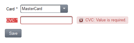
In this recipe, we will develop a special custom constraint and validators for validating a card verification code (CVC). CVC is used as security feature with bank card number. It is a number with a length between three and four digits. For instance, MasterCard or Visa require three digits and American Express requires four digits. Therefore, the CVC validation will depend on the selected bank card. User can select a bank card by a p:selectOneMenu, type a CVC into a p:inputText and submit the inputs after that.

How to do it...

We will start with a custom annotation used for CVC field.
import org.primefaces.validate.bean.ClientConstraint;
import javax.validation.Constraint;
import javax.validation.Payload;
import java.lang.annotation.Retention;
import java.lang.annotation.RetentionPolicy;
import java.lang.annotation.Target;
import static java.lang.annotation.ElementType.FIELD;
import static java.lang.annotation.ElementType.METHOD;

@Constraint(validatedBy = CvcConstraintValidator.class)
@ClientConstraint(resolvedBy = CvcClientConstraint.class)
@Target({FIELD, METHOD})
@Retention(RetentionPolicy.RUNTIME)
public @interface ValidCVC {

String message() default "{invalid.cvc.message}";

Class<?>[] groups() default {};

Class<? extends Payload>[] payload() default {};

// identifier of the select menu with cards
String forCardMenu() default "";
}
@Constraint is a regular annotation from the Bean Validation API and @ClientConstraint is one from the PrimeFaces CSV Framework, which helps to resolve metadata. The developed annotation defines the message key invalid.cvc.message and has the custom property forCardMenu. The value of this property is any search expression in terms of PrimeFaces Selectors (PFS) to reference the select menu with bank cards. This is necessary because the valid CVC value depends on the selected card.

The goal of CvcConstraintValidator is the validation of the input length.
public class CvcConstraintValidator implements ConstraintValidator<ValidCVC, Integer> {

@Override
public void initialize(ValidCVC validCVC) {
}

@Override
public boolean isValid(Integer cvc, ConstraintValidatorContext context) {
if (cvc == null || cvc < 0) {
return false;
}

int length = (int) (Math.log10(cvc) + 1);
return (length >= 3 && length <= 4);
}
}
The goal of the CvcClientConstraint is the preparing of metadata.
public class CvcClientConstraint implements ClientValidationConstraint {

private static final String CARDMENU_METADATA = "data-forcardmenu";

@Override
public Map<String, Object> getMetadata(ConstraintDescriptor constraintDescriptor) {
Map<String, Object> metadata = new HashMap<String, Object>();
Map attrs = constraintDescriptor.getAttributes();
String forCardMenu = (String) attrs.get("forCardMenu");
if (StringUtils.isNotBlank(forCardMenu)) {
metadata.put(CARDMENU_METADATA, forCardMenu);
}

return metadata;
}

@Override
public String getValidatorId() {
return ValidCVC.class.getSimpleName();
}
}
Let us go to the client-side implementation. First, we have to create a JavaScript file, say validators.js, and register there our own validator in the namespace PrimeFaces.validator with the name ValidCVC. This name is an unique ID returned by the method getValidatorId() (see the class CvcClientConstraint). The function to be implemented is called validate(). It has two parameters: the element itself and the current input value to be validated.
PrimeFaces.validator['ValidCVC'] = {
MESSAGE_ID: 'invalid.cvc',

validate: function (element, value) {
// find out selected menu value
var forCardMenu = element.data('forcardmenu');
var selOption = forCardMenu ?
PrimeFaces.expressions.SearchExpressionFacade.
resolveComponentsAsSelector(forCardMenu).find("select").val() : null;

var valid = false;
if (selOption && selOption === 'MCD') {
// MasterCard
valid = value > 0 && value.toString().length == 3;
} else if (selOption && selOption === 'AMEX') {
// American Express
valid = value > 0 && value.toString().length == 4;
}

if (!valid) {
throw PrimeFaces.util.ValidationContext.
getMessage(this.MESSAGE_ID);
}
}
};
Second, we have to create a JavaScript file for localized messages, e.g. lang_en.js.
PrimeFaces.locales['en'] = {
messages : PrimeFaces.locales['en_US'].messages
};

$.extend(PrimeFaces.locales['en'].messages, {
...

'invalid.cvc':
'Card Validation Code is invalid'
});
The bean has two required properties annotated with @NotNull. In addition, the property cvc is annotated with our custom annotation @ValidCVC. The value of the attribute forCardMenu points to the style class of the p:selectOneMenu that lists available bank cards.
@Named
@ViewScoped
public class ExtendCsvBean implements Serializable {

@NotNull
private String card;
@NotNull
@ValidCVC(forCardMenu = "@(.card)")
private Integer cvc;

public void save() {
RequestContext.getCurrentInstance().execute("alert('Saved!')");
}

// getters / setters
...
}
In the XHTML fragment, we have a select menu with two bank cards and an input field for CVC. The p:commandButton validates the fields and executes the method save() on postback.
<h:panelGrid id="pgrid" columns="3" cellpadding="3" style="margin-bottom:10px;">
<p:outputLabel for="card" value="Card"/>
<p:selectOneMenu id="card" styleClass="card"
value="#{extendCsvBean.card}">
<f:selectItem itemLabel="Please select a card"
itemValue="#{null}"/>
<f:selectItem itemLabel="MasterCard"
itemValue="MCD"/>
<f:selectItem itemLabel="American Express"
itemValue="AMEX"/>
</p:selectOneMenu>
<p:message for="card"/>

<p:outputLabel for="cvc" value="CVC"/>
<p:inputText id="cvc" value="#{extendCsvBean.cvc}"/>
<p:message for="cvc"/>
</h:panelGrid>

<p:commandButton validateClient="true" value="Save"
process="@this pgrid" update="pgrid" action="#{extendCsvBean.save}"/>
Note: As you can see, neither p:selectOneMenu nor p:inputText specifies the required attribute. We can achieve the transformation of the @NotNull annotation to the required attribute with the value true if we set the context parameter primefaces.TRANSFORM_METADATA to true.

In the last step, all required JavaScript files have to be included on the page.
<h:outputScript library="js" name="chapter10/lang_en.js"/>
<h:outputScript library="js" name="chapter10/validators.js"/>
The next two pictures show what happens when validations fails


If everything is ok, an alert box with the text Saved! is displayed to user.


How it works...

The message key invalid.cvc.message and the text should be put in resource bundles named ValidationMessages, e.g. ValidationMessages_en.properties. ValidationMessages is the standard name specified in the Bean Validation specification. The property files should be located in the application classpath and contain the following entry: invalid.cvc.message=Card Validation Code is invalid. This configuration is important for the server-side validation.

The method getMetadata() in the class CvcClientConstraint provides a map with name, value pairs. The metadata are exposed in the rendered HTML. The values can be accessed on the client-side via element.data(name), where element is an jQuery object for the underlying native HTML element. The CVC field with the metadata is rendered as
<input type="text" data-forcardmenu="@(.card)"
data-p-con="javax.faces.Integer" data-p-required="true"...>
The most interesting part is the implementation of the client-side validator. The value to be validated is already numeric because first it gets converted by the PrimeFaces’ built-in client-side converter for the data type java.lang.Integer. We only have to check if the value is positive and has a valid length. A valid length depends on the selected card in the menu p:selectOneMenu that can be accessed by the PrimeFaces JavaScript API as PrimeFaces.expressions.SearchExpressionFacade.resolveComponentsAsSelector(selector), where selector is any PrimeFaces selector, in our case @(.card). If the validation fails, we throw an exception by invoking throw PrimeFaces.util.ValidationContext.getMessage(text, parameter).

The client-side validation is triggered by setting validateClient=”true” on the p:commandButton.

PrimeFaces: Opening external pages in dynamically generated dialog

$
0
0
I already blogged about one recipe in the upcomming 2. edition of the PrimeFaces Cookbook. In this post, I would like to post the second recipe about a small framework called Dialog Framework. I personally like it because I remember my costly effort to do the same thing with the Struts Framework. When you wanted to load an external page into a popup and submit some data to this page, you had to call window.open with an hidden form, set passed values into hidden fields, submit the form to the external page via JavaScript and wait until the page is ready to use in window.onload or document.ready. A lot of manuelly work. PrimeFaces does this job for you and, in addition, provides with p:dialog a beautiful user interface as replacement for popup.

The regular usage of PrimeFaces' dialog is a declarative approach with p:dialog. Beside this declarative approach, there is a programmatic approach as well. The programmatic approach is based on a programmatic API where dialogs are created and destroyed at runtime. It is called Dialog Framework. The Dialog Framework is used to open external pages in dynamically generated dialog. The usage is quite simple, RequestContext provide two methods: openDialog and closeDialog that allow opening and closing dynamic dialogs. Furthermore, the Dialog Framework makes possible to pass data back from the page displayed in the dialog to the caller page.

In this recipe, we will demonstrate all features available in the Dialog Framework. We will open a dialog with options programmatically and pass parameters to the page displayed in this dialog. We will also meet the possibility for communicating between the source (caller) page and the dialog.

Getting ready

Dialog Framework requires the following configuration in faces-config.xml:
<application>
<action-listener>org.primefaces.application.DialogActionListener</action-listener>
<navigation-handler>org.primefaces.application.DialogNavigationHandler</navigation-handler>
<view-handler>org.primefaces.application.DialogViewHandler</view-handler>
</application>

How to do it...

We will develop a page with radio buttons to select one available PrimeFaces' book for rating. The rating itself happens in a dialog after a click on the button Rate the selected book.

The XHTML snippet to the screenshot is listed below.
<p:messages id="messages" showSummary="true" showDetail="false"/>

<p:selectOneRadio id="books" layout="pageDirection" value="#{dialogFrameworkBean.bookName}">
<f:selectItem itemLabel="PrimeFaces Cookbook" itemValue="PrimeFaces Cookbook"/>
<f:selectItem itemLabel="PrimeFaces Starter" itemValue="PrimeFaces Starter"/>
<f:selectItem itemLabel="PrimeFaces Beginner's Guide" itemValue="PrimeFaces Beginner's Guide"/>
<f:selectItem itemLabel="PrimeFaces Blueprints" itemValue="PrimeFaces Blueprints"/>
</p:selectOneRadio>

<p:commandButton value="Rate the selected book"
process="@this books"
actionListener="#{dialogFrameworkBean.showRatingDialog}"
style="margin-top: 15px">
<p:ajax event="dialogReturn" update="messages" listener="#{dialogFrameworkBean.onDialogReturn}"/>
</p:commandButton>
The page in the dialog is a full page bookRating.xhtml with a Rating component p:rating. It also shows the name of the book selected for rating.
<!DOCTYPE html>
<html xmlns="http://www.w3.org/1999/xhtml"
xmlns:f="http://xmlns.jcp.org/jsf/core"
xmlns:h="http://xmlns.jcp.org/jsf/html"
xmlns:p="http://primefaces.org/ui">
<f:view contentType="text/html" locale="en">
<f:metadata>
<f:viewParam name="bookName" value="#{bookRatingBean.bookName}"/>
</f:metadata>
<h:head>
<title>Rate the book!</title>
</h:head>
<h:body>
<h:form>
What is your rating for the book <strong>#{bookRatingBean.bookName}</strong>?

<p/>

<p:rating id="rating">
<p:ajax event="rate" listener="#{bookRatingBean.onrate}"/>
<p:ajax event="cancel" listener="#{bookRatingBean.oncancel}"/>
</p:rating>
</h:form>
</h:body>
</f:view>
</html>
The next screenshot demonstrates how the dialog looks like.


A click on a rating star or the cancel symbol closes the dialog. The source (caller) page displays a message with the selected rating value in the range from 0 till 5.

The most interesting part is the logic in beans. The bean DialogFrameworkBean opens the rating page within the dialog by invoking the method openDialog() with the outcome, options and POST parameters on a RequestContext instance. Furthermore, the bean defines an AJAX listener onDialogReturn() which is invoked when the data (selected rating) is returned from the dialog after it was closed.
@Named
@ViewScoped
public class DialogFrameworkBean implements Serializable {

private String bookName;

public void showRatingDialog() {
Map<String, Object> options = new HashMap<String, Object>();
options.put("modal", true);
options.put("draggable", false);
options.put("resizable", false);
options.put("contentWidth", 500);
options.put("contentHeight", 100);
options.put("includeViewParams", true);

Map<String, List<String>> params = new HashMap<String, List<String>>();
List<String> values = new ArrayList<String>();
values.add(bookName);
params.put("bookName", values);

RequestContext.getCurrentInstance().openDialog("/views/chapter11/bookRating", options, params);
}

public void onDialogReturn(SelectEvent event) {
Object rating = event.getObject();
FacesMessage message = new FacesMessage(FacesMessage.SEVERITY_INFO, "You rated the book with " + rating, null);

FacesContext.getCurrentInstance().addMessage(null, message);
}

// getters / setters
...
}
The bean BookRatingBean defines two listeners for the Rating component. They are invoked when the user clicks on a star and the cancel symbol respectively. We call there closeDialog() on a RequestContext instance to trigger the dialog closing and to pass the current rating value to the mentioned listener onDialogReturn().
@Named
@RequestScoped
public class BookRatingBean {

private String bookName;

public void onrate(RateEvent rateEvent) {
RequestContext.getCurrentInstance().closeDialog(rateEvent.getRating());
}

public void oncancel() {
RequestContext.getCurrentInstance().closeDialog(0);
}

// getters / setters
...
}

How it works...

The RequestContext provides two methods of the same name openDialog to open a dialog dynamically at runtime. The first one only has one parameter - the logical outcome used to resolve a navigation case. The second one has three parameters - outcome, dialog's configuration options and parameters that are sent to the view displayed in the dialog. We used the second variant in the example. The options are put into a Map as key, value pairs. The parameters are put into a Map too. In our case, we put the name of the selected book. After that, the name is received in the dialog's page bookRating.xhtml via the f:viewParam. f:viewParam sets the transferred parameter into the BookRatingBean, so that it is available in the heading above the Rating component. Tip: Please refer the PrimeFaces User's Guide to see a full list of supported dialog's configuration options.

Let us go through the request-response life cycle. Once the response is received from the request caused by the command button, a dialog gets created with an iframe inside. The URL of the iframe points to the full page, in our case bookRating.xhtml. The page will be streamed down and shown in the dialog. As you can see, there are always two requests: the first initial POST and the second GET sending by iframe. Note that the Dialog Framework only works with initial AJAX requests. Non-AJAX request are ignored. Please also note the the title of the dialog is taken from the HTML title element.

As we already mentioned above, the dialog can be closed programmatically by invoking the method closeDialog on a RequestContext instance. On the caller page, the button that triggers the dialog needs to have an AJAX listener for the dialogReturn event to be able to receive any data from the dialog. The data is passed as parameter to the method closeDialog(Object data). In the example, we pass either a positive integer value rateEvent.getRating() or 0.
Viewing all 79 articles
Browse latest View live